Diary Design
The design looks wonderful, I can’t believe you’ve made it look so good. Thank you so much.
A phone call from a delighted author
A blank canvas
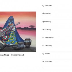
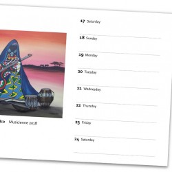
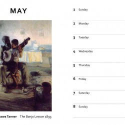
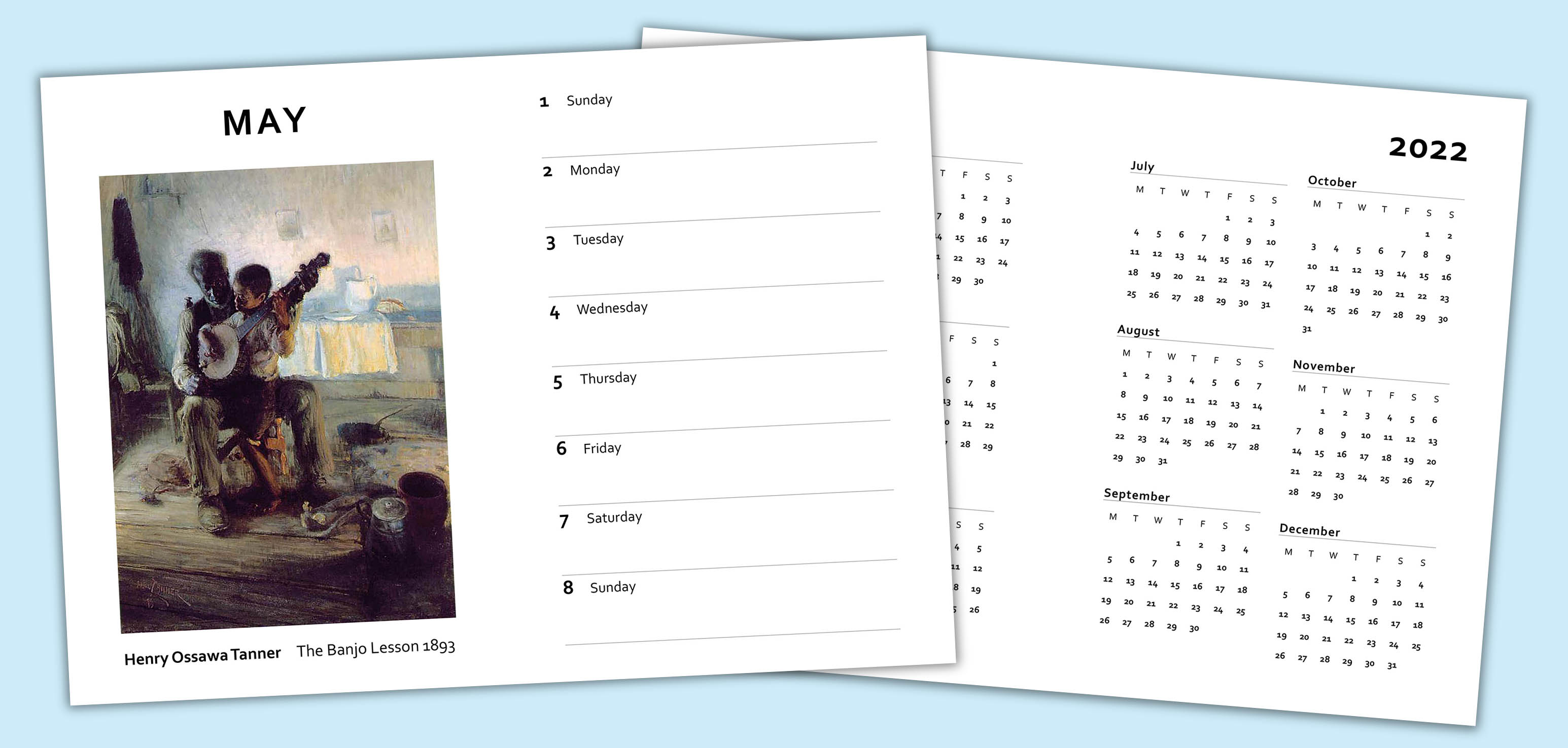
Akulah supplied a Word document with the basic pages laid out, but no real design ideas. From her initial instructions our design team got to work creating some sample pages. The only real guideline was that each month needed to have eight pages, four pages of dates, each opposite either a poem or picture.
Sourcing images
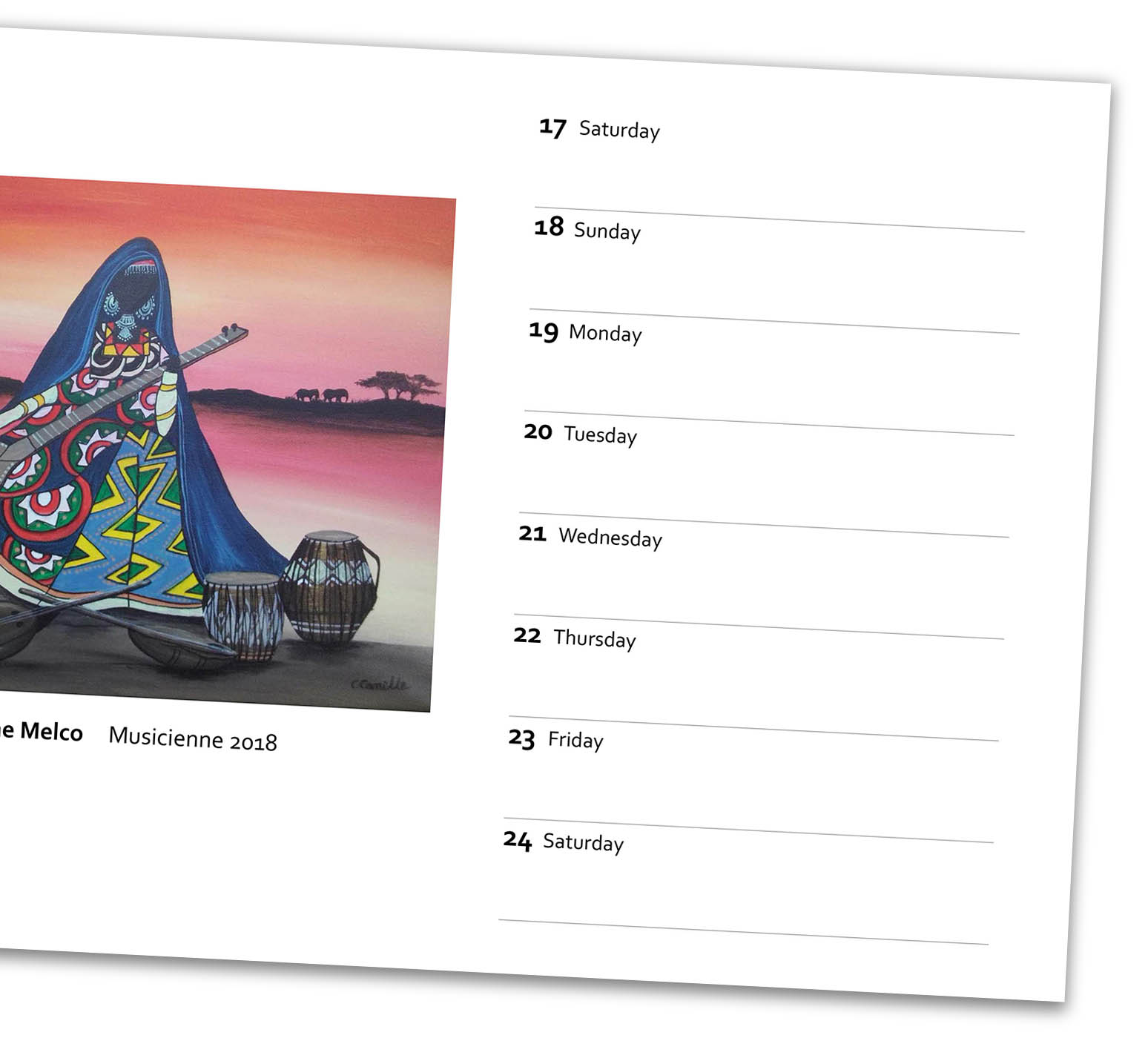
Some of the images supplied were fine for printing, but some needed better quality versions. While Akulah knew the images she wanted to use in the diary, better quality versions weren’t immediately available. With some work by our design team we were able to track down high resolution images of all the desired artwork so the printed version would be the best quality possible.
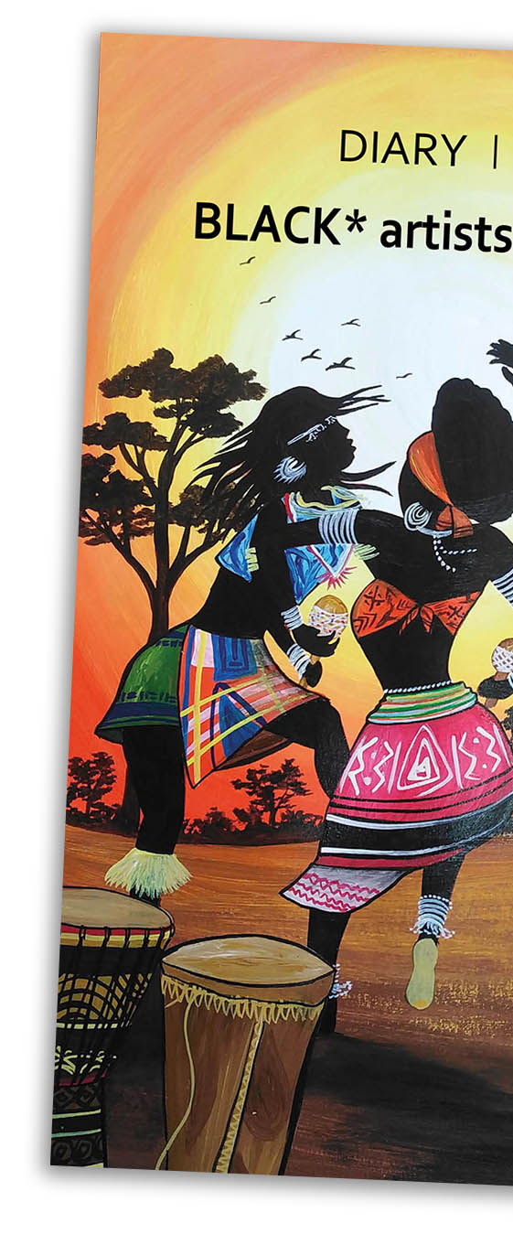
A vibrant cover
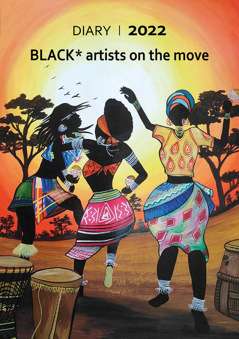
A beautifully vibrant and colourful image was supplied for the cover. A great rule to remember is to make the cover of your title impactful and relevant to the content. The cover is the promotional space to sell any book. If you get it right readers will pick up a copy and explore more. The cover for ‘BLACK* Artists on the Move’ is a master sales tool!
The complete service
Hopefully this page has given you a very brief idea of what is possible when publishing your title. If you’d like to find out more please email us at [email protected] or give us a call on 01580 766001. Our team are always on hand to answer any question you may have.


