Bowled Over
'Hi Colyn - yes, they [final files] look great. Thanks v much! And thanks again for all you have done with this book. Your work has been outstanding and Lisa and I are both delighted!'
Email from a very happy customer
Starting at the beginning
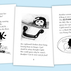
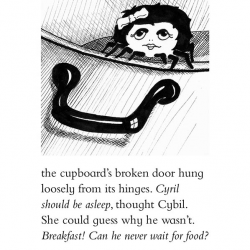
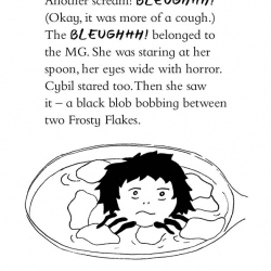
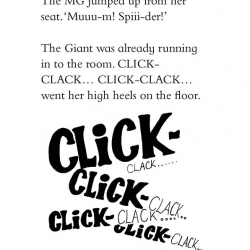
The first step was to create a page design that appealed to the age dermographic. The author originally wrote the story to allay her young daughter’s fear of spiders, and the publisher wanted a book that had the same feel as the Mr Men books, but wasn’t set in exactly the same format. We set to work on the page design, altering the traditional Mr Men page size slightly and flowing the text through with the images added within.
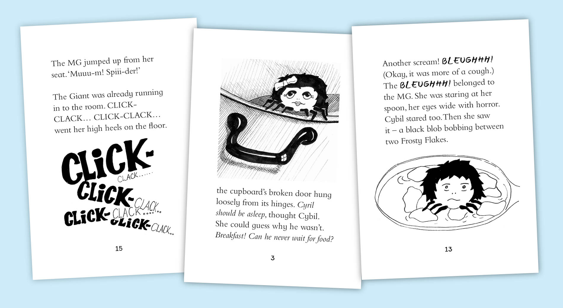
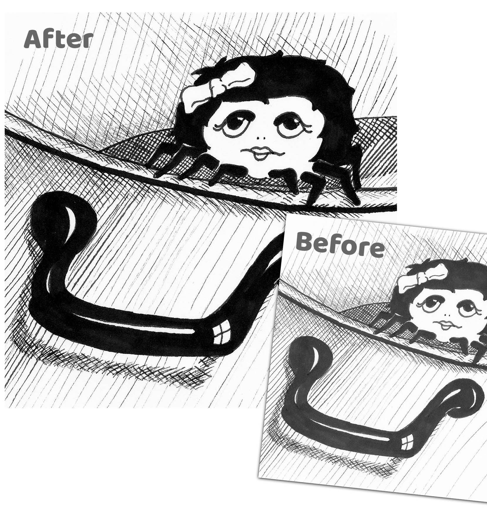
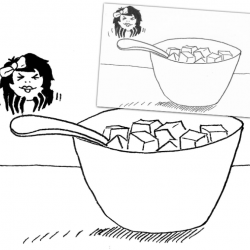
Image clean-up
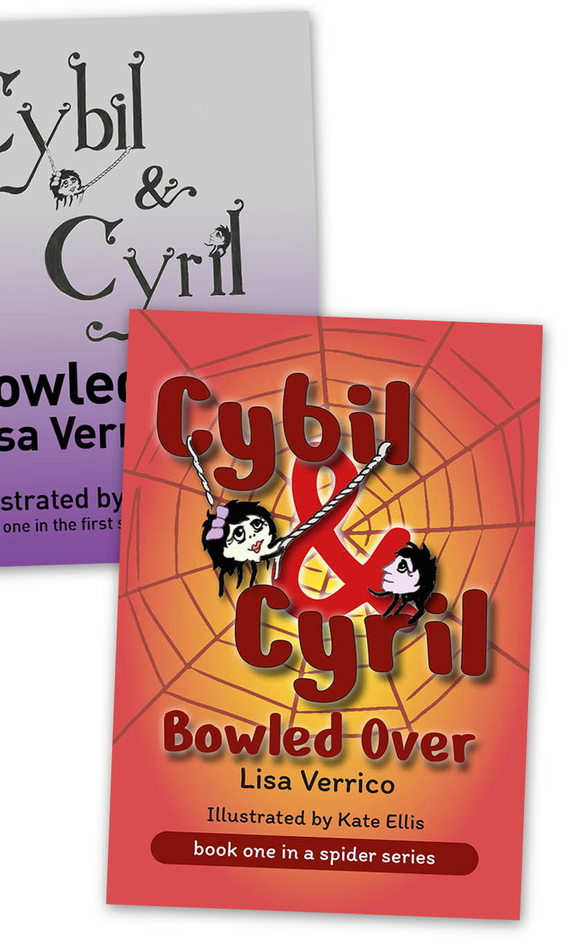
No cover – no problem
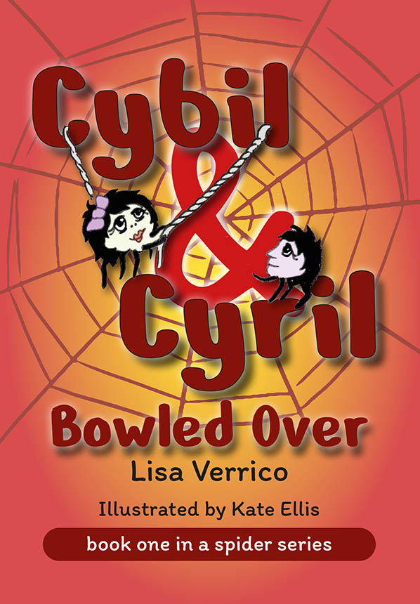
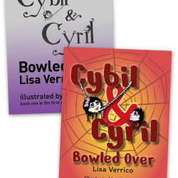
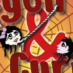
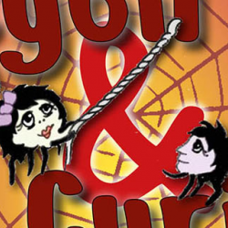
The illustrator had designed a very rough image for a potential cover design but asked our in-house team if they could expand on their initial idea. We felt the original design had some good elements to work with and decided to expand on these in producing the final cover. The main elements we felt had to be incorporated were the drawings of the two main charactersm Cybil and Cyril. After picking the out of the supplied image we cleaned them up and colourised them, adding a bit more life t make them stand out from the background.
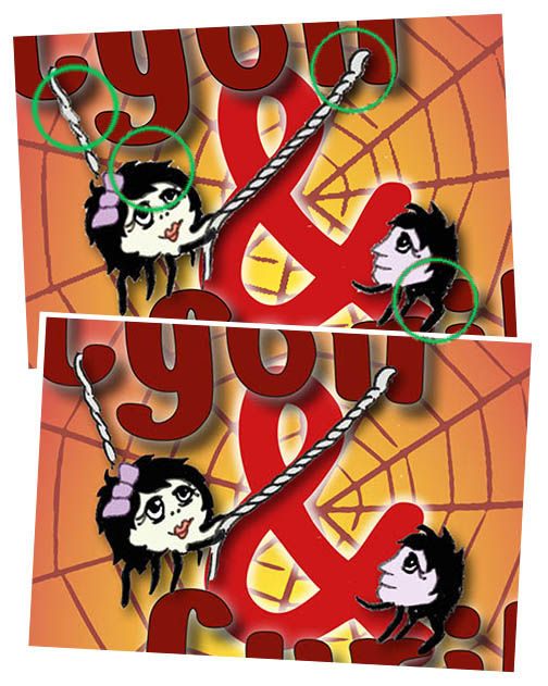
Final tweaks
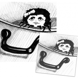
Our cover design had some rough edges which needed to be tidied up before the final files could be sent to the printer. After a little Photoshop work removing the white ‘halos’ around the two main characters and touching up the areas where the original ink marks had been faint, we were ready to go!
The complete service
Hopefully this page has given you a very brief idea of what is possible when publishing your title. If you’d like to find out more please email us at [email protected] or give us a call on 01580 766001. Our team are always on hand to answer any question you may have.


